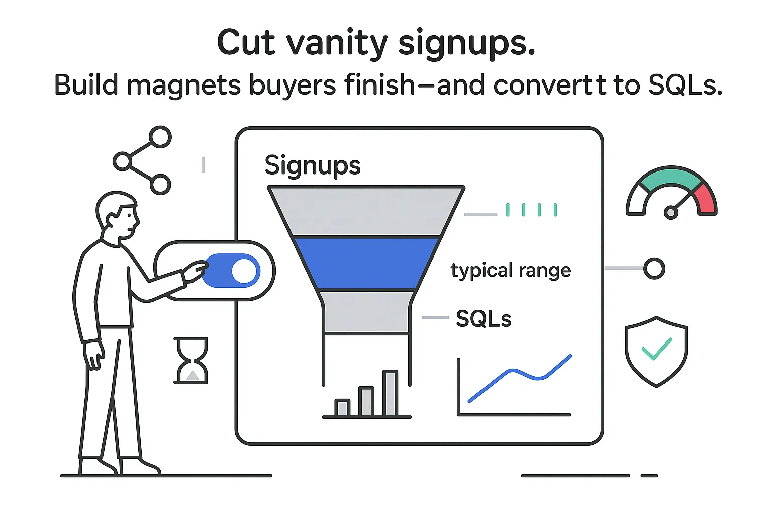
You want pipeline that grows without babysitting every campaign. You want proof, not poetry. If you have been burned by vague freebies before, you are not alone. I lean practical. I am sharing B2B lead magnet examples that busy service buyers actually finish in minutes, plus typical signup rates and SQL ranges so you can gut-check the upside before you invest a minute of build time.
What the numbers mean
- Warm traffic = people with prior brand exposure (retargeting, subscribers, existing followers). Cold traffic = net-new audiences.
- SQL = a lead accepted by sales against your agreed criteria. Definitions vary - track consistently across a 30–60 day window.
- Ranges come from service-firm funnels in NA/EU with ACVs typically $4k–$50k. Your niche and traffic quality will move the numbers. Treat these as directional benchmarks, not guarantees.
B2B lead magnet examples
Below are ten formats shaped for service firms that sell with context, proof, and math. For each, I note who it fits, what a prospect gets in 5–10 minutes, the natural next step, and benchmark ranges. Numbers vary by niche and traffic quality, but the ranges will help you forecast.
1) Case study lead magnet
- Who it is for: Any B2B service where outcomes are measurable (SEO, PPC, RevOps, CRO, analytics).
- What they get in 5–10 minutes: A tight 2–3 page PDF with problem, process, results. Metrics first, visuals simple.
- Next step: Button to "Replicate this plan for my business."
- Benchmarks: Signups 28–45% warm, 12–22% cold. SQL 8–20% when the case matches visitor industry and size.
2) ROI calculator
- Who it is for: PPC, SEO, CRO, analytics.
- What they get: A clean calculator using traffic, conversion rates, deal value, and close rate to show pipeline and revenue.
- Next step: Email the breakdown and invite them to a 90-day plan review.
- Benchmarks: Signups 22–40%. SQL 10–18% when the math is clear and tied to plausible scenarios.
3) Industry benchmark report
- Who it is for: Teams with data across one niche or access to public datasets.
- What they get: A short executive summary of medians (conversion, time to SQL, channel mix) plus 1–2 charts.
- Next step: Download the appendix after email confirmation; offer a comparison call.
- Benchmarks: Signups 20–35%. SQL 6–14%. Often earns links that lift organic demand.
4) Quick audit checklist with auto score
- Who it is for: SEO, CRO, marketing ops, automation.
- What they get: A short online assessment that grades a site or funnel and emails an out-of-100 score with three fixes.
- Next step: Invite to a deeper audit review.
- Benchmarks: Signups 30–48% warm, 15–28% cold. SQL 6–12%.
5) Pricing or budget planner
- Who it is for: SEO, paid media, content, analytics, RevOps.
- What they get: A planner mapping goals to budget bands and timeline realism.
- Next step: Book a short "budget sanity check."
- Benchmarks: Signups 18–32%. SQL 7–15%, higher with bottom-funnel content.
6) Proposal template bundle
- Who it is for: Agencies selling to founders and marketing leaders who write proposals for their own clients.
- What they get: An editable proposal doc, scope table, and kickoff agenda.
- Next step: Invite to a consult on adapting the templates.
- Benchmarks: Signups 25–42%. SQL 5–9%. Great for list growth that nurtures into later intent.
7) Executive briefing video
- Who it is for: Technical services needing plain language (analytics, CDP, RevOps, attribution).
- What they get: A 5–8 minute briefing on one decision (for example, migration timing) plus a one-page summary.
- Next step: Roadmap review link.
- Benchmarks: Signups 16–28%. SQL 10–16% when the topic hits current anxiety.
8) Funnel teardown PDF
- Who it is for: Conversion and performance teams.
- What they get: A point-by-point review of a live funnel with screenshots and keep/fix/test notes.
- Next step: Invite to a custom teardown session.
- Benchmarks: Signups 24–38%. SQL 9–17%.
9) Quarterly planning kit
- Who it is for: Strategy-forward firms selling ongoing packages.
- What they get: A one-page OKR template, forecasting sheet, and prioritization matrix tied to common growth goals.
- Next step: Book a planning workshop.
- Benchmarks: Signups 20–33%. SQL 6–12%.
10) Compliance or risk checklist
- Who it is for: Services in regulated fields (legal, finance, healthcare tech, data privacy).
- What they get: A checklist that flags quick risks and points to the policy or fix.
- Next step: Schedule a compliance gap review.
- Benchmarks: Signups 18–30%. SQL 8–19% in risk-sensitive sectors.
Notes for the busy founder: keep the promise tight, the outcome fast, and the next step obvious. Long ebooks look impressive, yet your buyer wants an answer in one coffee. Give them that, then make moving forward simple.
How I design the three top performers
I see three formats consistently pull above average: the case study, the ROI calculator, and the benchmark report. Here is how I build them so they ship fast and convert.
Case study
I lead with a single paragraph framed in the client’s words (for example, flat pipeline, rising CAC). I explain the process with plain text and one visual (account structure, content calendar), then show a table with lead volume lift, CAC change, sales cycle impact, and revenue. I make it filterable by industry and company size so a SaaS founder sees SaaS numbers. If I have one strong case, I slice it into mini versions that speak to different pains. CTA copy matches intent: "Replicate this plan for my business." Two short paragraphs per page, one chart, one pull quote, and a prominent results box keep reading ease high.
ROI calculator
I keep inputs to five: traffic or inbound leads, lead to MQL rate, MQL to SQL rate, close rate, and average deal value or LTV. Outputs show qualified pipeline, revenue at baseline, and conservative or expected or stretch scenarios. I share a sensitivity view so people can see how conversion rate or deal value shifts affect outcomes. I anchor ranges to internal benchmarks plus public data where relevant, and I email the detailed breakdown with assumptions so the math can be forwarded internally.
Industry benchmark report
Decision-makers want context in minutes, not a 40-pager. I organize an executive summary around three blocks: core KPIs (session to lead, time to SQL, SQL to close, deal value bands), channel contribution (pipeline share by organic, paid search, paid social, partner, referral), and recent trends (CPC shifts, content formats that moved pipeline, demo-to-close changes). For credibility, I add a methods note (sample size, time frame) and a CSV appendix. A short seasonality callout helps leaders interpret Q4 and Q1 swings.
What high-converting magnets share
- Specific to one buyer and one pain. If nobody sees themselves, nobody opts in.
- Outcome in under ten minutes. Promise a change you can deliver in one coffee.
- Your unique mechanism. Show how you work (scoring model, creative system) without fluff. One visual helps.
- Low friction. One action, one promise. Keep forms to five fields or fewer.
- Clear path to the next step. Every asset should set up a natural consult or demo or audit.
- Proof. Metrics, screenshots, short named testimonials, and methods. Real data calms doubt.
Build notes to keep your magnet honest
- State exactly who it is for in one sentence.
- Promise what they get in ten minutes or less.
- Name the one metric you will help them improve.
- Include one visual that explains your method.
- Use a short form (five fields or fewer).
- Offer one next step that carries the story forward.
- Trigger follow-ups from real intent (for example, pricing clicks, calculator edits).
Tie this to outcomes. Aim for channel-specific signup targets (for example, about 30% warm, about 15% cold) and track MQL to SQL weekly inside your CRM. If you miss three weeks in a row, adjust the promise or the audience before you adjust spend.
LinkedIn distribution that respects buyer attention
- Start with a creator post that tees up a specific problem (for example, leads stalled after a platform change), share one helpful nugget, and preview the asset as a native document (a short carousel). End with "Comment 'report' for the full version." Two hours later, reply to commenters with a friendly note and the landing page link. Place the full URL in the first comment and mention that in the post - native assets usually carry more reach.
- Publish a poll that aligns to your magnet (for example, "Which lever will move pipeline fastest this quarter?"). After it closes, thank voters and share the asset. Keep it helpful, not pushy.
- For paid reach, A/B test Lead Gen Forms against landing pages. Forms lower friction; landing pages often yield higher quality. Run both for a week at modest spend, then keep the winner. For targeting, combine senior roles (for example, VP Marketing, Head of Growth, Founder, COO) with company-size filters and a few interest signals. Avoid tiny audiences; 50k–200k gives the algorithm room to learn.
- After download, send a short sequence:
- Deliver the asset again for safekeeping.
- Ask a single, role-specific question (for example, "Do you track marketing-sourced SQL time to close?").
- Invite them to a brief consult that maps their first 90 days using their data.
Expect view-to-click in the 1–3% range on strong posts, landing page signups in the 20s, and SQL rates around 10–15% when the magnet hits one urgent pain with precision.
Conclusion
Pick one asset that solves a single pain for a single ICP. Ship it fast. Measure the full path - from page views to signup, from signup to MQL, from MQL to SQL, and finally to revenue. If numbers slip, adjust the promise or the audience with small, focused changes. Keep reporting simple: a weekly note showing traffic, signup rate, MQLs, SQLs, and revenue keeps everyone aligned without micromanagement.


.svg)