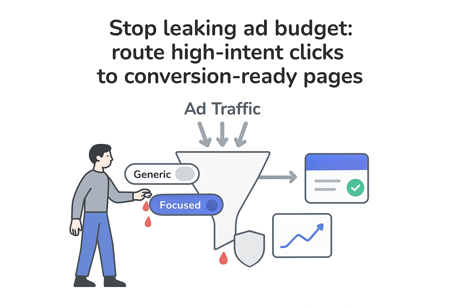
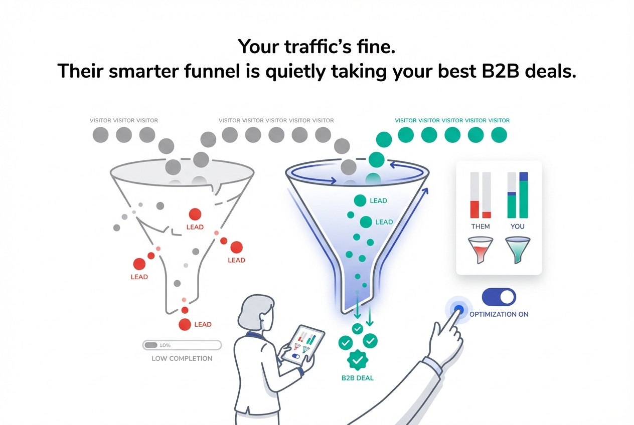
If you’re sending paid traffic or high-intent SEO visitors to a generic page, you’re paying to confuse them. A focused B2B landing page fixes that by giving each campaign a clear story, one goal, and an easy “yes” for the right buyer.
What a B2B landing page is (and when it isn’t the right choice)
A B2B landing page is a focused web page built for one audience and one offer, with the goal of turning visitors into leads or the next sales step. Unlike a general website page, it’s designed to answer intent quickly, reduce perceived risk, and make one action feel obvious.
It’s also not always the right destination. If the visitor’s intent is broad (brand research, partner validation, careers, investor info), a homepage or hub page can work better. But for campaign traffic (ads, specific SEO queries, email clicks), landing pages tend to outperform because they remove extra paths and keep the message consistent from click to conversion. If you’re diagnosing why a homepage isn’t converting, see Why Your B2B Homepage Fails the “5-Second Fit Test” and How to Fix It.
Here’s the practical difference:
| Aspect | Homepage | B2B landing page |
|---|---|---|
| Main purpose | Brand overview + navigation | Convert one audience for one offer |
| Traffic sources | Direct, branded search, referrals | Ads, specific SEO terms, campaign emails |
| Calls to action | Many | One primary action (repeated) |
| Navigation | Full menu | Minimal or none |
| Message | Broad | Deep focus on one problem and outcome |
| Measurement | Harder to tie to a campaign | Clear conversion rate and cost per lead |
Principles that drive conversions in B2B
I think of a strong B2B landing page as a focused sales conversation, not a brochure. The fundamentals are simple, but the bar is higher in B2B because deal sizes are larger, sales cycles are longer, and more people weigh in.
These principles show up on nearly every landing page that converts well:
- One offer for one audience (no “something for everyone” positioning).
- One primary action (one form, one booking flow, one download).
- Message match (the headline mirrors the ad, email, or query that brought the visitor). For a deeper playbook, see b2b landing page message match.
- Friction stays proportional to intent (don’t ask for proposal-level detail for a top-of-funnel download).
- Proof beats claims (numbers, specifics, recognizable context).
- The page reduces risk (sets expectations, explains what happens next, and removes ambiguity).
That last point is the B2B twist. Your page isn’t just trying to “get attention” - it’s trying to calm fear: fear of wasting budget, choosing the wrong vendor, looking bad internally, or committing to something they can’t unwind.
Copy that turns intent into action
A value proposition on a B2B landing page has one job: tell the right visitor “this is for you, here’s the outcome, and here’s the approach” in one or two sentences.
I keep it concrete. If someone can’t repeat the promise back after five seconds, it’s usually too vague.
A simple value prop pattern: [Outcome] for [specific audience], delivered through [method].
Example headline template 1: “SEO growth for B2B service firms that need pipeline, not vanity traffic”
Subheadline: “A structured approach to turn high-intent searches into qualified conversations over the next 2-4 quarters.”
Example headline template 2: “Paid search for B2B software teams focused on qualified demos”
Subheadline: “Tighter targeting, clearer landing pages, and cleaner measurement - so spend maps to pipeline.”
For the body copy, I stick to clarity over cleverness. A reliable structure is: headline, subheadline, a short benefits block, proof, then the call to action. Benefits land better when they translate features into buying outcomes (time saved, risk reduced, revenue impact, predictability, internal alignment).
CTA text should also reflect an outcome, not a button label. “Submit” is a dead end; “See if this fits our situation” or “Get the plan outline” tells the visitor what they win by clicking. Just make sure the CTA is honest - if the button says “Get the plan,” the next step must actually deliver a plan (or clearly explain what happens next).
Layout, design, and mobile performance
Most B2B buyers skim before they read, especially when the click comes from a mobile notification or a quick LinkedIn scroll. So I treat layout as a comprehension tool, not decoration.

A clean layout typically includes: a calm hero with the value prop and CTA, a quick benefits scan, proof near decision points, a short “how it works,” and then details for those who keep scrolling. Visual hierarchy matters more than “creative” design: clear spacing, readable typography, and obvious section breaks help a busy reader understand the offer without effort.
Mobile deserves special attention. It’s easy to assume B2B is desktop-only, but many founders and executives first open links on their phones between meetings. With the majority of internet users spending time on mobile, your page can’t be an afterthought. If your page forces pinching, hides the CTA, or loads slowly, you lose high-intent visitors before they even evaluate the message.
Google has repeatedly reported that as load time increases, bounce probability rises - so speed isn’t a nice-to-have; it’s part of conversion.
Proof and risk reduction (what stakeholders look for)
In B2B, proof is often the deciding factor because the buyer is trying to justify a decision to other people. I like to mix proof types so the page doesn’t rely on a single signal. For a deeper breakdown of what matters, see The B2B Trust Stack: Signals That Matter More Than Testimonials.
Client logos can help with instant recognition, but only if they’re relevant to the buyer’s world. Testimonials work best when they’re specific (what changed, in what timeframe, with what measurable outcome), and case study snippets work best when they show a before → after story rather than marketing adjectives. If you need a structure your buyers will actually read, use The Anti-Fluff B2B Case Study Template Buyers Actually Read.
It also helps to acknowledge stakeholder reality directly in the copy. A CEO typically wants the outcome, the timeline, and signs this won’t become a distraction. A marketing leader often looks for process clarity and measurement discipline. Ops or finance stakeholders often scan for terms, risk, and any compliance constraints. A good landing page doesn’t dump everything on everyone - it gives each role enough confidence to take the next step without turning the page into a wall of text.
Forms, CTAs, and qualification (without killing conversions)
Your form is where interest turns into an identifiable lead, so friction here is expensive.
I keep one primary CTA per page and repeat it in multiple places. The action stays the same; only placement changes. If you need deeper qualification, it’s usually better done after the first conversion (progressive profiling, follow-up questions, or sales discovery) rather than on the initial form.
Form fields should match intent level. For an educational download, name + work email + company is often enough. For a “talk to sales” request, adding role, website, and company size can be reasonable. What I try to avoid is asking for detailed budgets, long free-text fields, or multiple “required” questions before the visitor trusts the process. If lead quality is a recurring issue, pair your landing pages with From MQL to SQL: Fixing Lead Quality With Intent-Based Forms.
One more risk reducer that’s often missing: set expectations beside the form. A single sentence like “You’ll get an email with the asset within 2 minutes” or “This is a fit call, not a product demo” lowers anxiety and improves completion rate.
How I build a B2B landing page: a practical workflow
When I’m creating a page, I don’t start in design - I start in intent. A simple workflow keeps the page focused and prevents internal stakeholders from turning it into a mini-website:
- Define one offer and one success metric.
- Pin down the exact audience (role + company type + situation).
- Map the visitor’s top objections and the proof needed to answer them.
- Draft the above-the-fold message first (headline, subheadline, CTA).
- Build the page flow (benefits → proof → process → details → CTA repeats).
- Add measurement (source tracking, campaign tags, conversion events).
- Launch, learn, and iterate.
This is also where I make an explicit decision about what not to include: extra navigation, multiple competing CTAs, broad “about us” history, or features that don’t connect to the buyer’s outcome.
Measurement and platform choices (without overthinking the “best builder”)
The point of a landing page isn’t only to convert - it’s to measure what converts, by channel and by offer.
At minimum, I want three things working: the form submits into a lead system, the submission is tagged with campaign/source context, and analytics can tie page performance to downstream outcomes (meetings, opportunities, revenue). Without that, you can get leads and still not know what’s actually driving pipeline. For paid channels, combining on-page measurement with incrementality testing for b2b paid search helps you separate “nice correlation” from real lift.
On the “best landing page builder” question, I don’t think there’s one answer. I look at fit instead: does your team actually ship pages quickly, keep them consistent, and measure properly? Dedicated landing page tools are often faster for iteration, website CMS builders can be better for design control, and CRM-adjacent builders can simplify lead routing and attribution.
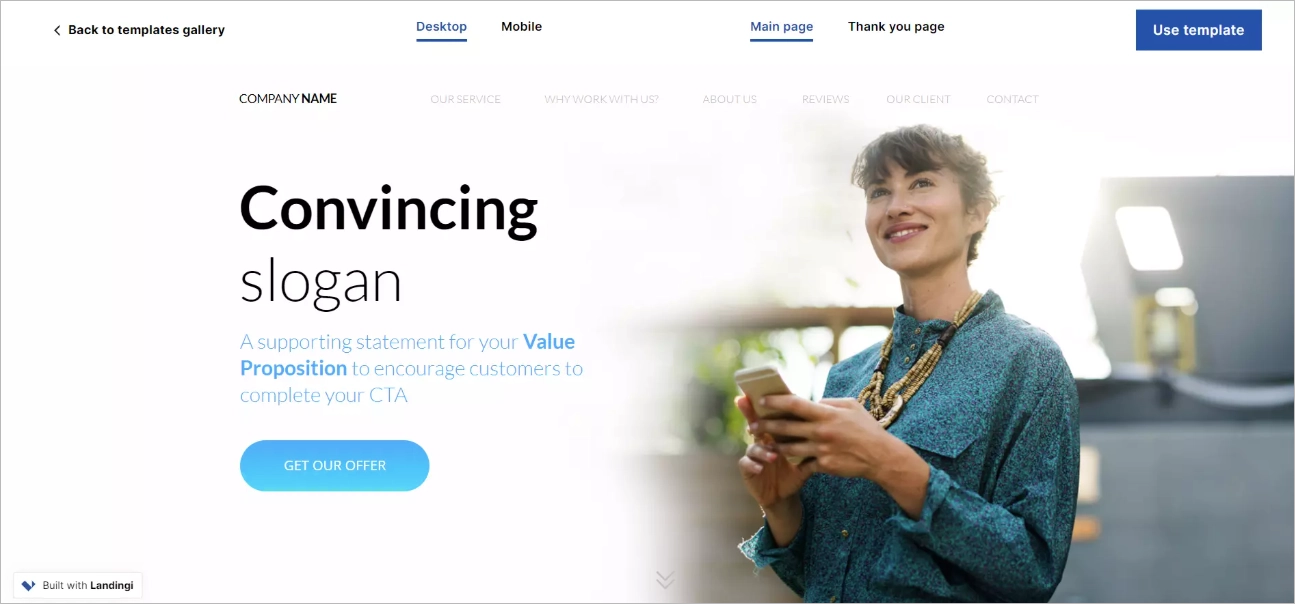
If speed-to-launch is the bottleneck, tools like Landingi can help you publish focused pages quickly, especially if you start from Landingi’s customizable templates and iterate in Landingi’s drag-and-drop builder.
Optimization: testing, personalization, and realistic benchmarks
Landing pages are closer to “living assets” than one-time projects. Small conversion lifts compound, especially when you’re paying for clicks.
I keep optimization grounded in a simple loop: measure baseline, change one thing, run a fair test, keep the winner, repeat. Early tests should focus on what visitors notice first: headline, hero visual, CTA language, and form length. It’s also worth checking that your ad promise and page headline are saying the same thing - message mismatch is one of the fastest ways to burn budget. If you want a straightforward way to run controlled experiments, use A/B testing to test one variable at a time.
When a page underperforms, I usually diagnose in this order:
- Offer clarity: can a stranger explain what they get and why it matters?
- Proof quality: are results specific, relevant, and believable?
- Form friction: are you asking for too much too soon?
- Relevance: does the page reflect the visitor’s intent and industry context?
- Urgency: is there a reason to act now (without fake scarcity)?
On benchmarks: conversion rates vary heavily by industry, traffic temperature, and offer type. Benchmark reports from landing page and analytics providers often show low single-digit conversion rates for cold paid traffic as common, with higher rates possible for warmer audiences (retargeting, email list clicks) and very clear offers. I use benchmarks only as a sanity check; the real goal is consistent improvement on your own traffic and funnel.
Personalization doesn’t have to mean complex technology. Even simple segmentation - separate pages by industry (SaaS vs services vs IT), separate offers for cold vs warm traffic, or adapting the headline to reflect the ad’s keyword theme - can lift conversion by making the visitor feel “this is for someone like me.”
Examples and repeatable templates (what changes by use case)
Different landing page types succeed for different reasons, but the core pattern stays the same: one audience, one offer, one action, proof near the decision point.
A product demo page tends to win when it explains what will happen on the call, shows credible product context (screens that demonstrate outcomes, not just UI), and qualifies lightly without feeling intrusive. A consulting/services page usually needs a clearer method and stronger proof because the buyer is “buying people,” not a self-serve product. A webinar or educational registration page typically converts best when the title promises a specific outcome, the agenda is visible at a glance, and logistics are explicit (time zone, duration, recording availability). A pricing page used as a landing page works when it reduces ambiguity around packages, contract expectations, and what’s included - without forcing every visitor into an immediate “contact us” dead end.
Once I see a structure working, I treat it like a reusable wireframe: keep the section order and design system consistent, and swap only what must change (audience, proof, offer details, and objections). That consistency reduces production time and makes performance comparisons cleaner across campaigns.
Strong B2B landing pages aren’t about flashy design or clever slogans. They’re about making it easy for the right companies to understand the offer, trust the outcome, and take a single next step - with measurement in place so you can keep improving rather than guessing.


.svg)