
The World Wide Web Consortium introduced a new logo in 2025, replacing its long-standing wordmark with an abstract symbol. W3C announced the change in an official press release and accompanying video: The World Wide Web Consortium (W3C) adopts a new logo to signal positive changes.
Key details
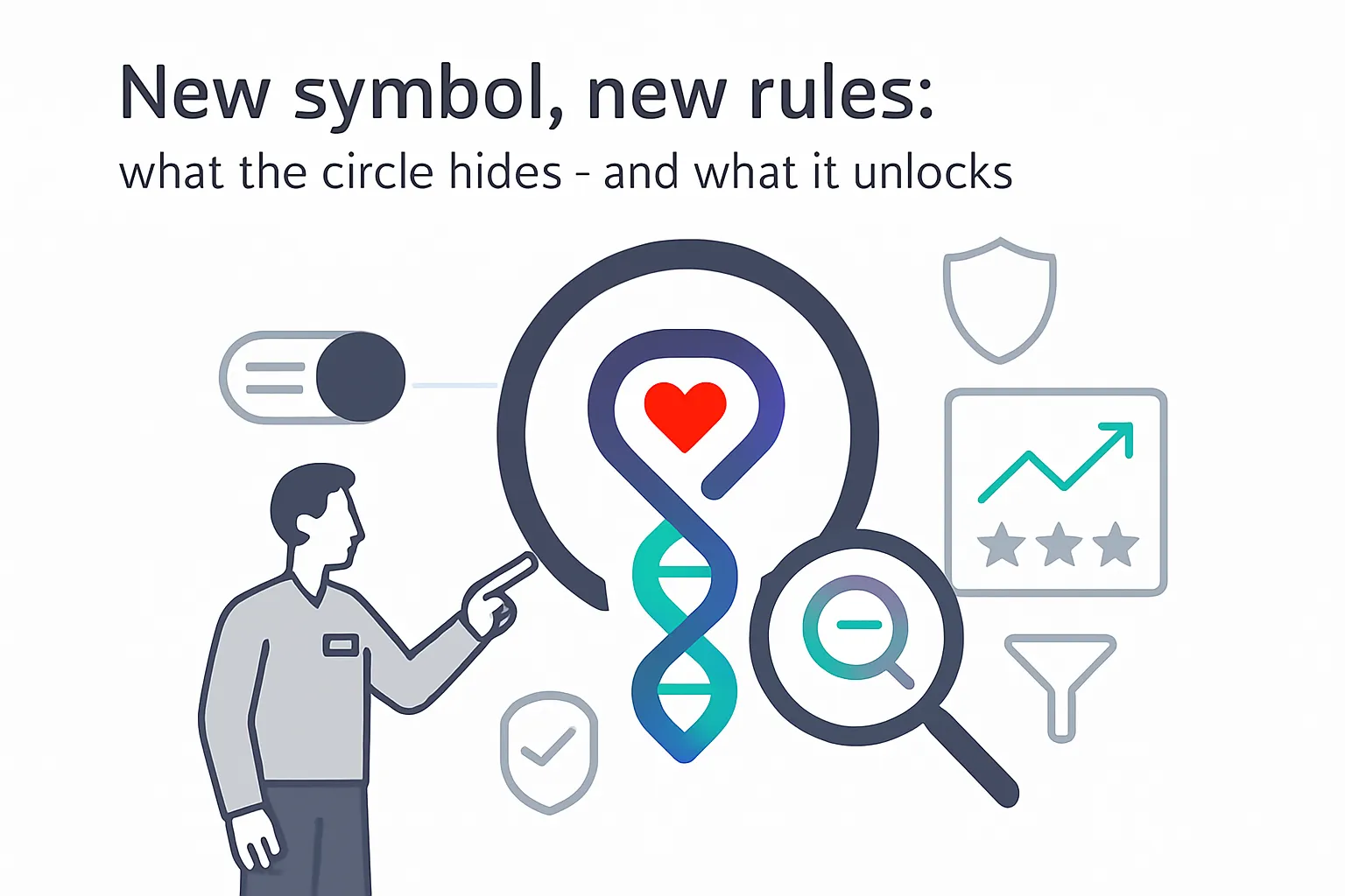
W3C is moving from letters and numerals to a globally inclusive abstract mark described as a circle enclosing a coil-like symbol.
- The circle represents unity, constant motion, and moving forward.
- The coil can evoke waves, a hand, or a DNA spiral, with one curl resembling a heart.
- The style is designed to transcend language families and writing directions to emphasize global connection.
- An explanatory video was released alongside the press release.
DNA at the heart of the web.
Background
W3C is an international community that develops open web standards across accessibility, internationalization, privacy, and security. The new symbol replaces a logo centered on the letters "W3C."
W3C was founded in 1994 by Tim Berners-Lee and coordinates standards development through global working groups. Its widely used specifications include Cascading Style Sheets, Scalable Vector Graphics, and the Web Content Accessibility Guidelines. The announcement video reiterates core values of openness, innovation, inclusion, accessibility, internationalization, privacy, and security.


.svg)

.svg)
.svg)