
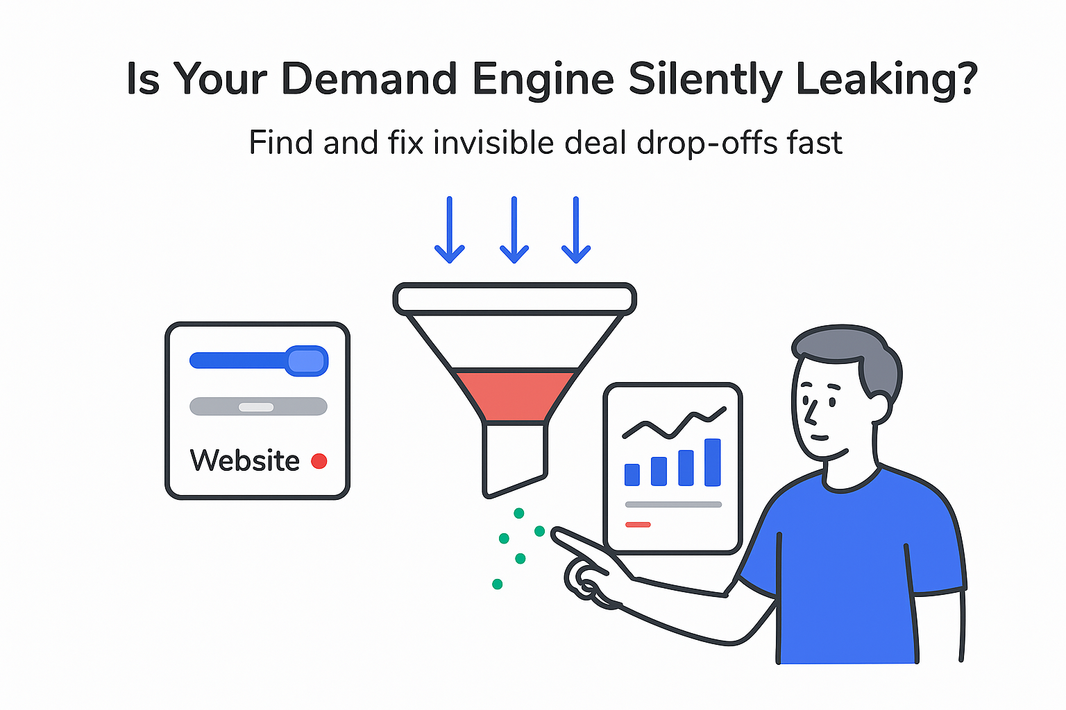
Your website should be the calm, predictable part of your growth engine: relevant traffic comes in, qualified conversations come out. Yet for many B2B service companies, the site behaves like a polished brochure - nice to look at, easy to ignore, and rarely responsible for meaningful pipeline. If you’re leaning on outbound and paid campaigns while your website mostly sits there, this is for you.
Why your B2B website isn’t converting (even if traffic looks “fine”)
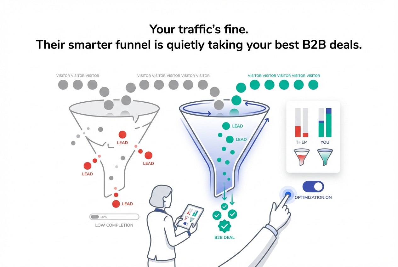
Here’s the uncomfortable truth: when a company is spending real money on marketing but still not seeing a steady stream of qualified inbound leads, the issue usually isn’t traffic volume. It’s that the website isn’t doing the selling work buyers now expect it to handle.
Here’s what that looks like in the real world:
- You rely heavily on outbound or paid because organic and direct traffic rarely turns into leads
- Your contact or demo form gets a trickle of submissions, not a meaningful share of pipeline
- Core pages (Services, Industries, Pricing) have high bounce rates or low engagement
- Prospects tell you some version of “I couldn’t tell what you actually do”
This isn’t just frustrating - it’s expensive. If paid and outbound end up carrying work your website should share, costs climb while results stay flat. If you’re weighing where to invest next, it helps to understand the tradeoff: The ROI of SEO vs Paid Ads: Which Delivers Better Long-Term Value?
Gartner has reported that by 2025, roughly 80% of B2B sales interactions between suppliers and buyers will happen in digital channels. Their research also suggests buyers spend only about 17% of their total buying time meeting with potential suppliers. When multiple vendors are involved, your sales team may get as little as 5% of the overall journey.
McKinsey has also found that a strong majority of B2B decision-makers now prefer remote or digital self-serve options over in-person meetings for many stages of the buying process. In plain terms: buyers want to educate themselves before they ever talk to your team.
When your website doesn’t support that self-education, three predictable outcomes follow: you miss pipeline that should have been yours, growth slows even as spend goes up, and customer acquisition costs rise because paid and outbound keep doing work the site should be doing.
A quick self-audit to see if your website is failing buyers
Instead of staying in theory, run a short self-audit. Answer these honestly - “I don’t know” counts as a no.
- Can a first-time visitor understand what you do, who you do it for, and why it matters in under 5 seconds on your home page?
- Do your top service pages show clear outcomes (not just activities or features) in the first screen?
- Does every high-intent page have a clear next step visible without scrolling?
- Do you know the visitor-to-lead conversion rate for your core service pages over the last 90 days?
- Can a finance stakeholder, a technical stakeholder, and an end user each find answers to their specific questions?
- Are you tracking form starts vs. form completions so you can see where people drop off?
- Does your site load in under about 3 seconds on mobile for key pages on a typical connection?
- Do you review website engagement and CRM outcomes together at least monthly (so you can connect visits to pipeline and revenue)?
If you answered “no” to 0-2, your foundation is reasonably healthy (and you likely still have upside). If you answered “no” to 3-5, you’re probably leaking high-intent visits. If you answered “no” to 6 or more, your website is actively working against your pipeline.
One extra signal I watch for is uncertainty. If nobody can answer these questions with confidence, the website isn’t being managed like a serious growth channel. In practice, this often shows up as weak b2b landing page message match across ads, pages, and sales conversations.
What modern B2B buyers expect when they land on your site
A shift that helps many founders: your buyers aren’t “B2B decision-makers” first. They’re people with consumer-grade expectations shaped by fast, intuitive digital experiences.
When they hit your site, they typically want to research independently, compare you against alternatives, validate that you’ve solved similar problems before, and gather material they can share internally to build consensus.
That internal sharing matters because the buying group is rarely one person. Gartner’s work on buying groups consistently points to committee-driven decisions. In practice, you’re selling to several viewpoints at once: someone who cares about ROI and risk, someone who cares about technical fit and security, someone who cares about operational impact, and the people who will live with the day-to-day workflow. If you need a practical way to map these viewpoints, start with ai for b2b persona research.
So your website can’t just “sound good.” It has to make the decision feel safe. That usually means fast performance and clean navigation, plain-language positioning, credible proof (with specifics), and enough depth that each stakeholder can answer their deal-breaker questions without booking a call just to get the basics.
Not every B2B service website needs to be award-winning. But there is a minimum standard where it stops holding you back. For many teams, that minimum includes fast mobile load times, clear above-the-fold messaging, visible paths to the next step on high-intent pages, and measurement that ties content and pages to qualified opportunities - not just traffic. For a broader framework on aligning your site to revenue steps, see B2B SaaS website: the pathway to your sales funnel.
The biggest mistakes that quietly bleed revenue
Most underperforming B2B service sites fail in familiar ways. The details vary by industry, but the conversion leaks usually fall into five buckets.
1) UX and performance issues
If the site is slow, cluttered, hard to scan, or awkward on mobile, buyers bounce before they process the message. In B2B, “looks outdated” is also a trust problem - it signals risk, even when your delivery is excellent. If you’re modernizing a site that’s costing you opportunities, consider investing in web design services in USA that prioritize clarity and conversion, not just visuals.
2) Messaging and positioning that’s company-first
When the copy is dominated by “our capabilities” and vague claims (“innovative,” “best-in-class”), visitors can’t connect it to their problem. If they have to work to understand your offer, many won’t - especially when comparing multiple vendors. If your language is technical because your work is technical, this is still fixable: Overly technical jargon is one of the most common conversion killers.
3) Broken conversion paths
Some sites give only one option: a generic contact form. Others bury the next step or make it feel like paperwork. Even high-intent buyers stall when the path forward is unclear, intimidating, or time-consuming.
4) Thin content and misaligned search intent
A service page that says little more than “we do X” doesn’t help a buyer assess fit. And content that attracts the wrong queries may inflate traffic while producing low-quality leads. Depth matters most on the pages your buyers use to validate, compare, and shortlist.
5) Weak proof and operational gaps behind the site
If outcomes aren’t specific, proof is hard to find, or inquiries aren’t routed and followed up consistently, the website becomes a dead end. Trust doesn’t come from adjectives - it comes from evidence and a reliable handoff when someone raises their hand. If you want a focused checklist, see Security and trust signals that increase checkout confidence (many of the same signals apply to B2B lead capture and qualification).
Any one of these can hurt performance. Together, they explain why a site can look “professional” and still fail to produce pipeline.
Where conversions typically stall (and what to measure)
I find it useful to treat conversion as a chain of small commitments, not one big leap. A simple version looks like this:
- Search or referral → click to site
- Landing page view → initial understanding
- Engagement → scroll/click to relevant sections
- Primary action click (contact/pricing/request)
- Form start → form completion
- Qualified opportunity
Different problems show up at different steps. Low click-through from search can be a relevance or messaging problem in how pages appear in results. High bounce rates often point to slow performance or weak first-impression clarity. Low action clicks usually mean the page doesn’t build enough confidence - or the next step isn’t visible and compelling. High form abandonment tends to be friction: too many fields, unclear expectations, or a request that feels too big for where the buyer is in their journey.
Healthy ranges vary by deal size, industry, and how strict qualification is. What matters is consistency and trend direction: your highest-intent pages should improve over time, and website-originated leads shouldn’t be dramatically lower quality than other channels unless your targeting is off.
To make this practical, measure behavior (page speed, engagement, action clicks, form starts/completions) alongside outcomes (qualified opportunities and closed revenue). When those two views are separated, teams optimize for vanity metrics. When they’re connected, fixes become targeted instead of random.
Fixes that move the needle without a full redesign
You don’t always need a redesign to fix a failing B2B website. In many cases, the fastest gains come from focused improvements on pages closest to revenue - core service pages, key industry/use-case pages, pricing (if you publish it), and your main contact or request page.
When I’m prioritizing, I look for a small set of high-leverage moves:
- Clarify the first-screen story. Every key page should quickly communicate the problem you solve, who it’s for, and the outcome buyers should expect - without jargon.
- Tighten navigation around real buyer paths. Reduce choice overload and use labels buyers naturally understand, not internal terminology.
- Make the next step obvious and low-friction. Put a clear primary action on high-intent pages, and support it with a secondary path for visitors who need more proof before they talk.
- Fix “cheap” UX issues first. Mobile layout problems, slow assets, distracting clutter, and inconsistent page patterns often create immediate conversion drag.
- Strengthen proof where decisions happen. Add specifics (results, context, constraints, what changed) on the pages buyers use for comparison - not buried in one isolated section.
The last piece is ownership. Without a named owner, a metric target, and a timeline, even good fixes turn into half-finished projects. Website improvement should be ongoing, not a one-time event: should be an ongoing process.
A practical 30-day improvement sprint (built for lean teams)
If I had to structure a month of work for a B2B service company, I’d keep it tight and biased toward revenue pages.
Week 1: Fix clarity on the highest-value pages
Focus on the home page plus the handful of pages most often used in sales cycles. The goal is simple: a smart outsider should be able to explain what you do, who it’s for, and why it matters after a fast scan. That usually means rewriting vague headlines into outcome-driven statements, swapping jargon for concrete problems, and placing proof earlier on the page rather than at the bottom.
Week 2: Repair conversion paths
Once the message is clearer, make action-taking feel easy. Put the primary action above the fold, ensure the next step matches intent (buyers who are ready vs. buyers who are still validating), and remove friction from forms. Align page actions to what sales actually does next, so buyers aren’t surprised by the follow-up. If follow-up is inconsistent, tighten the handoff with a Sales and marketing SLA that makes follow-up happen.
Week 3: Tune content depth and search alignment
Review whether each key page matches buyer intent: does it answer the questions someone asks when comparing vendors? Then tighten page structure so it’s skimmable and specific, add internal linking where it naturally supports decision-making, and refresh any older content that still gets attention but no longer reflects how the company sells or delivers.
Week 4: Connect measurement to pipeline
Confirm that key actions are tracked consistently and that inquiries can be attributed to the pages and sources that influenced them. The goal isn’t perfect attribution - it’s dependable visibility into what’s driving qualified conversations so you can keep improving with confidence. Once tracking is stable, layer in controlled experiments with Simple A/B testing for busy teams: what to test first.
By the end of 30 days, the goal isn’t a “perfect website.” It’s a site with a stronger first impression, clearer decision support, less conversion friction, and measurement that makes future improvements easier and more accountable. That’s what turns a website from a brochure into a real, compounding growth asset.


.svg)

.svg)
.svg)